Karta CSS Tailwind zawierająca wyłącznie CSS ze stylami konturu, cienia i płaskiego. Kompaktowe, domyślne i duże rozmiary. Zawartość karty, tytuł karty, miejsca na stopkę karty. WCAG AA, współpracuje z Django, HTMX, Laravel, React i dowolnym stosem.
Elementy kart to wszechstronne pojemniki umożliwiające łączenie powiązanych informacji w jedną, spójną wizualnie całość. Zbudowane z semantycznego kodu HTML i elastycznych obszarów treści, karty organizują treść hierarchicznie i dostosowują się do różnych układów. System kart Frutjam oferuje wiele wariantów kolorystycznych, rozmiarów i stylów prezentacji produktów, postów na blogu, referencji i elementów pulpitu nawigacyjnego.
Tylko CSS, nie wymaga JavaScript. Dostępny w WCAG AA i niezależny od frameworka: współpracuje z Django, HTMX, Laravel, React i dowolnym stosem.
| Klasa | Typ | Opis |
|---|---|---|
| card | Opierać | Podwyższony pojemnik na zawartość z zaokrąglonymi narożnikami |
| card-outline | Styl | Przezroczyste wypełnienie z widoczną krawędzią |
| card-dashed | Styl | Styl przerywanej granicy |
| card-title | Modyfikator | Element nagłówka wewnątrz karty |
| card-content | Modyfikator | Wyściełany obszar zawartości karty |
| card-actions | Modyfikator | Obszar stopki dla przycisków i elementów sterujących akcjami |
| card-link | Modyfikator | Ustawia całą kartę jako cel kliknięcia dla jednego łącza i przesuwa pierścień ostrości na kartę |
| card-xs | Rozmiar | Bardzo mała wyściółka |
| card-sm | Rozmiar | Mała wyściółka |
| card-md | Rozmiar | Średnie wypełnienie (domyślne) |
| card-lg | Rozmiar | Duża wyściółka |
| card-xl | Rozmiar | Bardzo duża wyściółka |
| card-primary | Kolor | Podstawowy kolor motywu |
| card-secondary | Kolor | Kolor motywu drugorzędnego |
| card-accent | Kolor | Kolor motywu akcentującego |
| card-neutral | Kolor | Neutralny kolor motywu |
| card-info | Kolor | Kolor semantyczny informacji |
| card-success | Kolor | Sukces semantyczny kolor |
| card-warning | Kolor | Ostrzeżenie kolor semantyczny |
| card-error | Kolor | Błąd koloru semantycznego |
Podstawowe użycie
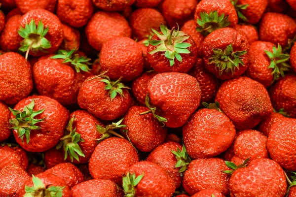
Card Title
The Card component is a versatile container for combining related information into a single, visually appealing unit.
1 2 3 4 5 6 7 8 9 | <div class="card shadow w-88"> <figure> <img src="https://cdn.frutjam.com/images/photo-1.jpg?format=webp&width=600&height=400" alt="Card Image" loading="lazy" /> </figure> <div class="card-content"> <h2 class="card-title">Card Title</h2> <p>The Card component is a versatile container for combining related information into a single, visually appealing unit.</p> </div> </div> |
1 2 3 4 5 6 7 8 9 | <div className="card shadow w-88"> <figure> <img src="https://cdn.frutjam.com/images/photo-1.jpg?format=webp&width=600&height=400" alt="Card Image" loading="lazy" /> </figure> <div className="card-content"> <h2 className="card-title">Card Title</h2> <p>The Card component is a versatile container for combining related information into a single, visually appealing unit.</p> </div> </div> |
Karta z Akcjami
Używać card-actions , aby dodać obszar stopki dla przycisków i elementów sterujących akcjami.
Card Title
A card with an actions footer for user interactions like buttons and links.
1 2 3 4 5 6 7 8 9 10 | <div class="card card-md shadow w-88"> <div class="card-content"> <h2 class="card-title">Card Title</h2> <p>A card with an actions footer for user interactions like buttons and links.</p> <div class="card-actions"> <button class="btn btn-primary">Accept</button> <button class="btn">Dismiss</button> </div> </div> </div> |
Karta klikalna
Dodać card-link do jednego linku wewnątrz karty, a cała karta staje się celem kliknięcia. Karta nadal jest article z nagłówkiem i akapitem, dzięki czemu czytnik ekranu trafia do prawdziwego linku, a nie do opakowania, a zamiast kilku jest jeden tabulator.
Kyoto, day to night
Local setup notes, language resources and community links.
1 2 3 4 5 6 | <article class="card card-outline card-md w-88" aria-labelledby="kyoto"> <div class="card-content"> <h2 class="card-title" id="kyoto"><a class="card-link" href="/guides/kyoto">Kyoto, day to night</a></h2> <p>Local setup notes, language resources and community links.</p> </div> </article> |
1 2 3 4 5 6 | <article className="card card-outline card-md w-88" aria-labelledby="kyoto"> <div className="card-content"> <h2 className="card-title" id="kyoto"><a className="card-link" href="/guides/kyoto">Kyoto, day to night</a></h2> <p>Local setup notes, language resources and community links.</p> </div> </article> |
Skupienie się na klawiaturze to część, która robi to dobrze. W przeciwnym razie przeglądarka obrysowałaby tylko tekst łącza, kilka słów na karcie, na którą mysz może kliknąć w dowolnym miejscu, więc card-link przesuwa pierścień na kartę i ukrywa wewnętrzny. Pierścień używa currentColor, co oznacza, że pozostaje czytelny dalej card-primary i na każdy temat.
Tekst na karcie pozostaje wybieralny, a inne przyciski nadal działają, więc karta może jednocześnie przenosić główne miejsce docelowe i dodatkowe działania.
1 2 3 4 5 6 7 8 9 10 | <article class="card card-outline card-md w-88" aria-labelledby="product-1"> <div class="card-content"> <h2 class="card-title" id="product-1"><a class="card-link" href="/products/1">Product 1</a></h2> <p>Description of the product.</p> <div class="card-actions"> <button class="btn btn-sm btn-primary">Add to cart</button> <button class="btn btn-sm btn-outline">Save</button> </div> </div> </article> |
Rozmiary kart
Wybierz jeden z pięciu wariantów rozmiarów, aby dopasować się do różnych gęstości treści i przypadków użycia.
Extra Small
Compact card for minimal content.
Small
Small card for condensed information.
Medium
Medium card for standard content.
Large
Large card for prominent content display.
Extra Large
Extra large card for expansive content layouts.
1 2 3 4 5 6 7 8 9 10 11 12 13 14 15 16 17 18 19 20 21 22 23 24 25 26 27 28 29 30 31 32 33 34 | <div class="card card-xs card-outline"> <div class="card-content"> <h2 class="card-title">Extra Small</h2> <p>Compact card for minimal content.</p> </div> </div> <div class="card card-sm card-outline"> <div class="card-content"> <h2 class="card-title">Small</h2> <p>Small card for condensed information.</p> </div> </div> <div class="card card-md card-outline"> <div class="card-content"> <h2 class="card-title">Medium</h2> <p>Medium card for standard content.</p> </div> </div> <div class="card card-lg card-outline"> <div class="card-content"> <h2 class="card-title">Large</h2> <p>Large card for prominent content display.</p> </div> </div> <div class="card card-xl card-outline"> <div class="card-content"> <h2 class="card-title">Extra Large</h2> <p>Extra large card for expansive content layouts.</p> </div> </div> |
Kolory kart
Zastosuj warianty kolorystyczne do kart w celu wizualnego rozróżnienia i znaczenia semantycznego.
Default
Base card color using default theme background.
Primary
Primary color card for featured content.
Secondary
Secondary color card for supporting content.
Accent
Accent color card for emphasis.
Info
Information card for helpful content.
Success
Success card for positive outcomes.
Warning
Warning card for caution messages.
Error
Error card for error notifications.
Neutral
Neutral card for balanced design.
1 2 3 4 5 6 7 8 9 10 11 12 13 14 15 16 17 18 19 20 21 22 23 24 25 26 27 28 29 30 31 32 33 34 35 36 37 38 39 40 41 42 43 44 45 46 47 48 49 50 51 52 53 54 55 56 57 58 59 60 61 62 | <div class="card card-md"> <div class="card-content"> <h2 class="card-title">Default</h2> <p>Base card color using default theme background.</p> </div> </div> <div class="card card-md card-primary"> <div class="card-content"> <h2 class="card-title">Primary</h2> <p>Primary color card for featured content.</p> </div> </div> <div class="card card-md card-secondary"> <div class="card-content"> <h2 class="card-title">Secondary</h2> <p>Secondary color card for supporting content.</p> </div> </div> <div class="card card-md card-accent"> <div class="card-content"> <h2 class="card-title">Accent</h2> <p>Accent color card for emphasis.</p> </div> </div> <div class="card card-md card-info"> <div class="card-content"> <h2 class="card-title">Info</h2> <p>Information card for helpful content.</p> </div> </div> <div class="card card-md card-success"> <div class="card-content"> <h2 class="card-title">Success</h2> <p>Success card for positive outcomes.</p> </div> </div> <div class="card card-md card-warning"> <div class="card-content"> <h2 class="card-title">Warning</h2> <p>Warning card for caution messages.</p> </div> </div> <div class="card card-md card-error"> <div class="card-content"> <h2 class="card-title">Error</h2> <p>Error card for error notifications.</p> </div> </div> <div class="card card-md card-neutral"> <div class="card-content"> <h2 class="card-title">Neutral</h2> <p>Neutral card for balanced design.</p> </div> </div> |
Niestandardowy kolor tła i tekstu
Użyj dowolnego narzędzia Tailwind do kolorowania tła i tekstu bezpośrednio na karcie, aby uzyskać pełną kontrolę nad kolorami.
Custom Colors
Apply any background and text color using Tailwind utilities.
1 2 3 4 5 6 | <div class="card bg-primary text-on-primary w-88"> <div class="card-content"> <h2 class="card-title">Custom Colors</h2> <p>Apply any background and text color using Tailwind utilities.</p> </div> </div> |
Style kart
Zastosuj różne warianty obramowania i stylizacji do kart w celu wizualnego wyróżnienia.
Karta zarysu
Outline Style
Cards with visible borders for subtle separation from background.
Primary Outline
Outline card with primary color border.
1 2 3 4 5 6 7 8 9 10 11 12 13 | <div class="card card-md card-outline"> <div class="card-content"> <h2 class="card-title">Outline Style</h2> <p>Cards with visible borders for subtle separation from background.</p> </div> </div> <div class="card card-md card-outline card-primary"> <div class="card-content"> <h2 class="card-title">Primary Outline</h2> <p>Outline card with primary color border.</p> </div> </div> |
Karta przerywana
Dashed Style
Cards with dashed borders for visual interest.
Secondary Dashed
Dashed card with secondary color border.
1 2 3 4 5 6 7 8 9 10 11 12 13 | <div class="card card-md card-dashed"> <div class="card-content"> <h2 class="card-title">Dashed Style</h2> <p>Cards with dashed borders for visual interest.</p> </div> </div> <div class="card card-md card-dashed card-secondary"> <div class="card-content"> <h2 class="card-title">Secondary Dashed</h2> <p>Dashed card with secondary color border.</p> </div> </div> |
Karty z obrazami
Łącz karty z figurkami, aby uzyskać treści zawierające elementy wizualne.
Obraz u góry

Blog Post Card
Display articles with featured images, titles, and summaries for content discovery.
1 2 3 4 5 6 7 8 9 | <div class="card card-md w-88 shadow-sm"> <figure> <img src="https://cdn.frutjam.com/images/photo-2.jpg?format=webp&width=600&height=400" alt="Blog Post" loading="lazy" /> </figure> <div class="card-content"> <h2 class="card-title">Blog Post Card</h2> <p>Display articles with featured images, titles, and summaries for content discovery.</p> </div> </div> |
Obraz na dole
Image Below Content
Place images after content for reverse visual hierarchy.
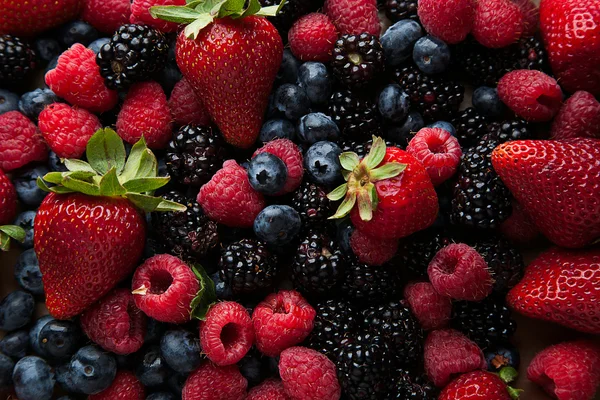
1 2 3 4 5 6 7 8 9 | <div class="card card-md w-88 shadow-sm"> <div class="card-content"> <h2 class="card-title">Image Below Content</h2> <p>Place images after content for reverse visual hierarchy.</p> </div> <figure> <img src="https://cdn.frutjam.com/images/photo-3.jpg?format=webp&width=600&height=400" alt="Footer Image" loading="lazy" /> </figure> </div> |
Karta cenowa
Zaprezentuj poziomy cenowe za pomocą funkcji i przycisków wezwania do działania.
Startup Plan
- ✓ 25 websites
- ✓ 150 templates
- ✓ Advanced eCommerce
- ✗ Unlimited storage
1 2 3 4 5 6 7 8 9 10 11 12 13 14 15 16 17 18 19 20 21 22 23 24 25 26 27 28 29 30 31 | <div class="card card-lg card-outline"> <div class="card-content gap-4"> <div> <h2 class="card-title">Startup Plan</h2> <div class="flex items-baseline gap-2"> <span class="text-3xl font-bold">$49</span> <span class="text-sm text-on-base/60">/month</span> </div> </div> <div class="divider my-0"></div> <ul class="flex flex-col gap-3"> <li class="flex items-center gap-2"> <span class="badge badge-success badge-sm">✓</span> <span>25 websites</span> </li> <li class="flex items-center gap-2"> <span class="badge badge-success badge-sm">✓</span> <span>150 templates</span> </li> <li class="flex items-center gap-2"> <span class="badge badge-success badge-sm">✓</span> <span>Advanced eCommerce</span> </li> <li class="flex items-center gap-2"> <span class="badge badge-error badge-sm opacity-50">✗</span> <span class="opacity-50">Unlimited storage</span> </li> </ul> <button class="btn btn-primary w-full">Get Started</button> </div> </div> |
Responsywny układ karty
Twórz elastyczne układy kart, które dostosowują się do różnych rozmiarów ekranów.

Responsive Layout
On desktop, image and content display side by side. On mobile, they stack vertically for optimal viewing experience.
1 2 3 4 5 6 7 8 9 10 11 12 13 14 15 16 17 18 | <div class="card card-lg w-160 shadow-sm"> <div class="grid grid-cols-12 gap-0"> <div class="col-span-12 lg:col-span-5"> <figure class="h-64"> <picture> <source media="(max-width: 1024px)" srcset="https://cdn.frutjam.com/images/photo-4.jpg?format=webp&width=640&height=427"> <img src="https://cdn.frutjam.com/images/photo-4.jpg?format=webp&width=600&height=400" alt="Layout Image" class="w-full h-full object-cover" loading="lazy" /> </picture> </figure> </div> <div class="col-span-12 lg:col-span-7"> <div class="card-content"> <h2 class="card-title">Responsive Layout</h2> <p>On desktop, image and content display side by side. On mobile, they stack vertically for optimal viewing experience.</p> </div> </div> </div> </div> |
Połączone warianty
Mieszaj i dopasowuj warianty rozmiaru, koloru i stylu, aby uzyskać niestandardowe projekty kart.
Large Primary Outline
Combination of large size, primary color, and outline style.
Small Secondary Dashed
Compact card with dashed border in secondary color.
Extra Large Accent
Prominent card with accent color for feature display.
1 2 3 4 5 6 7 8 9 10 11 12 13 14 15 16 17 18 19 20 | <div class="card card-lg card-primary card-outline"> <div class="card-content"> <h2 class="card-title">Large Primary Outline</h2> <p>Combination of large size, primary color, and outline style.</p> </div> </div> <div class="card card-sm card-dashed card-secondary"> <div class="card-content"> <h2 class="card-title">Small Secondary Dashed</h2> <p>Compact card with dashed border in secondary color.</p> </div> </div> <div class="card card-xl card-accent"> <div class="card-content"> <h2 class="card-title">Extra Large Accent</h2> <p>Prominent card with accent color for feature display.</p> </div> </div> |
Używasz kodu Claude'a, kursora lub innego edytora AI?
Cherry MCP na żądanie udostępnia edytorowi AI dokładne nazwy i strukturę klas Karta. Żadnych więcej zajęć z halucynacjami.