Thẻ CSS Tailwind chỉ có CSS với các kiểu đường viền, bóng và phẳng. Kích thước nhỏ gọn, mặc định và lớn. Khe cắm nội dung thẻ, tiêu đề thẻ, chân trang thẻ. WCAG AA, hoạt động với Django, HTMX, Laravel, React và bất kỳ ngăn xếp nào.
Các thành phần của thẻ là những vật chứa linh hoạt để kết hợp các thông tin liên quan thành một đơn vị gắn kết trực quan duy nhất. Được xây dựng bằng HTML ngữ nghĩa và các vùng nội dung linh hoạt, thẻ sắp xếp nội dung theo thứ bậc và thích ứng với nhiều bố cục khác nhau. Hệ thống thẻ Frutjam cung cấp nhiều biến thể màu sắc, kích thước và kiểu dáng để giới thiệu sản phẩm, bài đăng trên blog, lời chứng thực và các thành phần bảng điều khiển.
Chỉ CSS, không cần JavaScript. WCAG AA có thể truy cập và không phụ thuộc vào khung: hoạt động với Django, HTMX, Laravel, React và bất kỳ ngăn xếp nào.
| Lớp học | Kiểu | Sự miêu tả |
|---|---|---|
| card | Căn cứ | Thùng chứa nội dung nâng cao với các góc được bo tròn |
| card-outline | Phong cách | Điền trong suốt với đường viền có thể nhìn thấy |
| card-dashed | Phong cách | Kiểu đường viền nét đứt |
| card-title | Công cụ sửa đổi | Phần tử tiêu đề bên trong thẻ |
| card-content | Công cụ sửa đổi | Khu vực nội dung đệm của thẻ |
| card-actions | Công cụ sửa đổi | Khu vực chân trang cho các nút và điều khiển hành động |
| card-link | Công cụ sửa đổi | Làm cho toàn bộ thẻ trở thành mục tiêu nhấp chuột cho một liên kết và di chuyển vòng lấy nét vào thẻ |
| card-xs | Kích cỡ | Phần đệm cực nhỏ |
| card-sm | Kích cỡ | Đệm nhỏ |
| card-md | Kích cỡ | Khoảng đệm trung bình (mặc định) |
| card-lg | Kích cỡ | Phần đệm lớn |
| card-xl | Kích cỡ | Phần đệm cực lớn |
| card-primary | Màu sắc | Màu chủ đề chính |
| card-secondary | Màu sắc | Màu chủ đề phụ |
| card-accent | Màu sắc | Màu chủ đề nhấn mạnh |
| card-neutral | Màu sắc | Màu chủ đề trung tính |
| card-info | Màu sắc | Màu sắc ngữ nghĩa thông tin |
| card-success | Màu sắc | Màu ngữ nghĩa thành công |
| card-warning | Màu sắc | Màu ngữ nghĩa cảnh báo |
| card-error | Màu sắc | Lỗi ngữ nghĩa màu sắc |
Cách sử dụng cơ bản
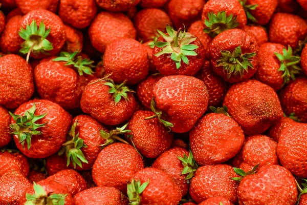
Card Title
The Card component is a versatile container for combining related information into a single, visually appealing unit.
1 2 3 4 5 6 7 8 9 | <div class="card shadow w-88"> <figure> <img src="https://cdn.frutjam.com/images/photo-1.jpg?format=webp&width=600&height=400" alt="Card Image" loading="lazy" /> </figure> <div class="card-content"> <h2 class="card-title">Card Title</h2> <p>The Card component is a versatile container for combining related information into a single, visually appealing unit.</p> </div> </div> |
1 2 3 4 5 6 7 8 9 | <div className="card shadow w-88"> <figure> <img src="https://cdn.frutjam.com/images/photo-1.jpg?format=webp&width=600&height=400" alt="Card Image" loading="lazy" /> </figure> <div className="card-content"> <h2 className="card-title">Card Title</h2> <p>The Card component is a versatile container for combining related information into a single, visually appealing unit.</p> </div> </div> |
Thẻ có hành động
Sử dụng card-actions để thêm khu vực chân trang cho các nút và điều khiển hành động.
Card Title
A card with an actions footer for user interactions like buttons and links.
1 2 3 4 5 6 7 8 9 10 | <div class="card card-md shadow w-88"> <div class="card-content"> <h2 class="card-title">Card Title</h2> <p>A card with an actions footer for user interactions like buttons and links.</p> <div class="card-actions"> <button class="btn btn-primary">Accept</button> <button class="btn">Dismiss</button> </div> </div> </div> |
Thẻ có thể nhấp
Thêm vào card-link vào một liên kết bên trong thẻ và toàn bộ thẻ sẽ trở thành mục tiêu nhấp chuột của thẻ đó. Thẻ vẫn là một article bằng một tiêu đề và một đoạn văn, do đó, trình đọc màn hình sẽ gặp liên kết thực chứ không phải là trình bao bọc và có một điểm dừng tab thay vì nhiều điểm dừng.
Kyoto, day to night
Local setup notes, language resources and community links.
1 2 3 4 5 6 | <article class="card card-outline card-md w-88" aria-labelledby="kyoto"> <div class="card-content"> <h2 class="card-title" id="kyoto"><a class="card-link" href="/guides/kyoto">Kyoto, day to night</a></h2> <p>Local setup notes, language resources and community links.</p> </div> </article> |
1 2 3 4 5 6 | <article className="card card-outline card-md w-88" aria-labelledby="kyoto"> <div className="card-content"> <h2 className="card-title" id="kyoto"><a className="card-link" href="/guides/kyoto">Kyoto, day to night</a></h2> <p>Local setup notes, language resources and community links.</p> </div> </article> |
Tiêu điểm bàn phím là phần chính xác. Nếu không, trình duyệt sẽ chỉ phác thảo văn bản liên kết, một vài từ bên trong thẻ mà chuột có thể nhấp vào bất kỳ đâu trên đó, vì vậy card-link di chuyển chiếc nhẫn vào thẻ và giấu chiếc bên trong. Chiếc nhẫn sử dụng currentColor, có nghĩa là nó vẫn có thể đọc được trên card-primary và trên mọi chủ đề.
Văn bản trong thẻ vẫn có thể được chọn và các nút khác tiếp tục hoạt động, do đó, thẻ có thể mang đích đến chính và các hành động phụ cùng một lúc.
1 2 3 4 5 6 7 8 9 10 | <article class="card card-outline card-md w-88" aria-labelledby="product-1"> <div class="card-content"> <h2 class="card-title" id="product-1"><a class="card-link" href="/products/1">Product 1</a></h2> <p>Description of the product.</p> <div class="card-actions"> <button class="btn btn-sm btn-primary">Add to cart</button> <button class="btn btn-sm btn-outline">Save</button> </div> </div> </article> |
Kích cỡ thẻ
Chọn từ năm biến thể kích thước để phù hợp với mật độ nội dung và trường hợp sử dụng khác nhau.
Extra Small
Compact card for minimal content.
Small
Small card for condensed information.
Medium
Medium card for standard content.
Large
Large card for prominent content display.
Extra Large
Extra large card for expansive content layouts.
1 2 3 4 5 6 7 8 9 10 11 12 13 14 15 16 17 18 19 20 21 22 23 24 25 26 27 28 29 30 31 32 33 34 | <div class="card card-xs card-outline"> <div class="card-content"> <h2 class="card-title">Extra Small</h2> <p>Compact card for minimal content.</p> </div> </div> <div class="card card-sm card-outline"> <div class="card-content"> <h2 class="card-title">Small</h2> <p>Small card for condensed information.</p> </div> </div> <div class="card card-md card-outline"> <div class="card-content"> <h2 class="card-title">Medium</h2> <p>Medium card for standard content.</p> </div> </div> <div class="card card-lg card-outline"> <div class="card-content"> <h2 class="card-title">Large</h2> <p>Large card for prominent content display.</p> </div> </div> <div class="card card-xl card-outline"> <div class="card-content"> <h2 class="card-title">Extra Large</h2> <p>Extra large card for expansive content layouts.</p> </div> </div> |
Màu thẻ
Áp dụng các biến thể màu sắc cho thẻ để phân biệt hình ảnh và ý nghĩa ngữ nghĩa.
Default
Base card color using default theme background.
Primary
Primary color card for featured content.
Secondary
Secondary color card for supporting content.
Accent
Accent color card for emphasis.
Info
Information card for helpful content.
Success
Success card for positive outcomes.
Warning
Warning card for caution messages.
Error
Error card for error notifications.
Neutral
Neutral card for balanced design.
1 2 3 4 5 6 7 8 9 10 11 12 13 14 15 16 17 18 19 20 21 22 23 24 25 26 27 28 29 30 31 32 33 34 35 36 37 38 39 40 41 42 43 44 45 46 47 48 49 50 51 52 53 54 55 56 57 58 59 60 61 62 | <div class="card card-md"> <div class="card-content"> <h2 class="card-title">Default</h2> <p>Base card color using default theme background.</p> </div> </div> <div class="card card-md card-primary"> <div class="card-content"> <h2 class="card-title">Primary</h2> <p>Primary color card for featured content.</p> </div> </div> <div class="card card-md card-secondary"> <div class="card-content"> <h2 class="card-title">Secondary</h2> <p>Secondary color card for supporting content.</p> </div> </div> <div class="card card-md card-accent"> <div class="card-content"> <h2 class="card-title">Accent</h2> <p>Accent color card for emphasis.</p> </div> </div> <div class="card card-md card-info"> <div class="card-content"> <h2 class="card-title">Info</h2> <p>Information card for helpful content.</p> </div> </div> <div class="card card-md card-success"> <div class="card-content"> <h2 class="card-title">Success</h2> <p>Success card for positive outcomes.</p> </div> </div> <div class="card card-md card-warning"> <div class="card-content"> <h2 class="card-title">Warning</h2> <p>Warning card for caution messages.</p> </div> </div> <div class="card card-md card-error"> <div class="card-content"> <h2 class="card-title">Error</h2> <p>Error card for error notifications.</p> </div> </div> <div class="card card-md card-neutral"> <div class="card-content"> <h2 class="card-title">Neutral</h2> <p>Neutral card for balanced design.</p> </div> </div> |
Màu nền và văn bản tùy chỉnh
Sử dụng bất kỳ tiện ích màu văn bản và nền Tailwind nào trực tiếp trên thẻ để kiểm soát đầy đủ màu sắc.
Custom Colors
Apply any background and text color using Tailwind utilities.
1 2 3 4 5 6 | <div class="card bg-primary text-on-primary w-88"> <div class="card-content"> <h2 class="card-title">Custom Colors</h2> <p>Apply any background and text color using Tailwind utilities.</p> </div> </div> |
Kiểu thẻ
Áp dụng các biến thể đường viền và kiểu dáng khác nhau cho thẻ để phân biệt trực quan.
Thẻ phác thảo
Outline Style
Cards with visible borders for subtle separation from background.
Primary Outline
Outline card with primary color border.
1 2 3 4 5 6 7 8 9 10 11 12 13 | <div class="card card-md card-outline"> <div class="card-content"> <h2 class="card-title">Outline Style</h2> <p>Cards with visible borders for subtle separation from background.</p> </div> </div> <div class="card card-md card-outline card-primary"> <div class="card-content"> <h2 class="card-title">Primary Outline</h2> <p>Outline card with primary color border.</p> </div> </div> |
Thẻ nét đứt
Dashed Style
Cards with dashed borders for visual interest.
Secondary Dashed
Dashed card with secondary color border.
1 2 3 4 5 6 7 8 9 10 11 12 13 | <div class="card card-md card-dashed"> <div class="card-content"> <h2 class="card-title">Dashed Style</h2> <p>Cards with dashed borders for visual interest.</p> </div> </div> <div class="card card-md card-dashed card-secondary"> <div class="card-content"> <h2 class="card-title">Secondary Dashed</h2> <p>Dashed card with secondary color border.</p> </div> </div> |
Thẻ có hình ảnh
Kết hợp các thẻ với số liệu cho nội dung có chứa các yếu tố hình ảnh.
Hình ảnh ở trên cùng
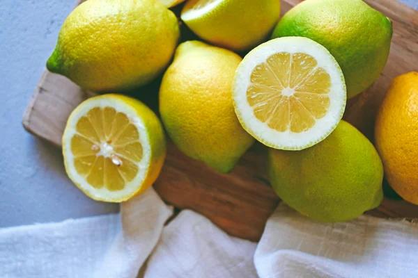
Blog Post Card
Display articles with featured images, titles, and summaries for content discovery.
1 2 3 4 5 6 7 8 9 | <div class="card card-md w-88 shadow-sm"> <figure> <img src="https://cdn.frutjam.com/images/photo-2.jpg?format=webp&width=600&height=400" alt="Blog Post" loading="lazy" /> </figure> <div class="card-content"> <h2 class="card-title">Blog Post Card</h2> <p>Display articles with featured images, titles, and summaries for content discovery.</p> </div> </div> |
Hình ảnh ở dưới cùng
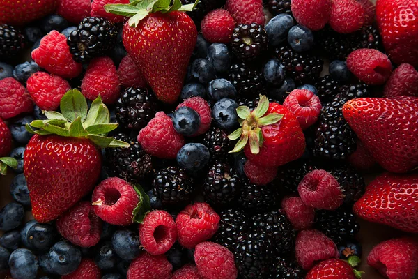
Image Below Content
Place images after content for reverse visual hierarchy.
1 2 3 4 5 6 7 8 9 | <div class="card card-md w-88 shadow-sm"> <div class="card-content"> <h2 class="card-title">Image Below Content</h2> <p>Place images after content for reverse visual hierarchy.</p> </div> <figure> <img src="https://cdn.frutjam.com/images/photo-3.jpg?format=webp&width=600&height=400" alt="Footer Image" loading="lazy" /> </figure> </div> |
Thẻ định giá
Hiển thị các mức giá bằng các tính năng và nút kêu gọi hành động.
Startup Plan
- ✓ 25 websites
- ✓ 150 templates
- ✓ Advanced eCommerce
- ✗ Unlimited storage
1 2 3 4 5 6 7 8 9 10 11 12 13 14 15 16 17 18 19 20 21 22 23 24 25 26 27 28 29 30 31 | <div class="card card-lg card-outline"> <div class="card-content gap-4"> <div> <h2 class="card-title">Startup Plan</h2> <div class="flex items-baseline gap-2"> <span class="text-3xl font-bold">$49</span> <span class="text-sm text-on-base/60">/month</span> </div> </div> <div class="divider my-0"></div> <ul class="flex flex-col gap-3"> <li class="flex items-center gap-2"> <span class="badge badge-success badge-sm">✓</span> <span>25 websites</span> </li> <li class="flex items-center gap-2"> <span class="badge badge-success badge-sm">✓</span> <span>150 templates</span> </li> <li class="flex items-center gap-2"> <span class="badge badge-success badge-sm">✓</span> <span>Advanced eCommerce</span> </li> <li class="flex items-center gap-2"> <span class="badge badge-error badge-sm opacity-50">✗</span> <span class="opacity-50">Unlimited storage</span> </li> </ul> <button class="btn btn-primary w-full">Get Started</button> </div> </div> |
Bố cục thẻ đáp ứng
Tạo bố cục thẻ linh hoạt thích ứng trên các kích thước màn hình khác nhau.

Responsive Layout
On desktop, image and content display side by side. On mobile, they stack vertically for optimal viewing experience.
1 2 3 4 5 6 7 8 9 10 11 12 13 14 15 16 17 18 | <div class="card card-lg w-160 shadow-sm"> <div class="grid grid-cols-12 gap-0"> <div class="col-span-12 lg:col-span-5"> <figure class="h-64"> <picture> <source media="(max-width: 1024px)" srcset="https://cdn.frutjam.com/images/photo-4.jpg?format=webp&width=640&height=427"> <img src="https://cdn.frutjam.com/images/photo-4.jpg?format=webp&width=600&height=400" alt="Layout Image" class="w-full h-full object-cover" loading="lazy" /> </picture> </figure> </div> <div class="col-span-12 lg:col-span-7"> <div class="card-content"> <h2 class="card-title">Responsive Layout</h2> <p>On desktop, image and content display side by side. On mobile, they stack vertically for optimal viewing experience.</p> </div> </div> </div> </div> |
Các biến thể kết hợp
Trộn và kết hợp các biến thể kích thước, màu sắc và kiểu dáng cho các thiết kế thiệp tùy chỉnh.
Large Primary Outline
Combination of large size, primary color, and outline style.
Small Secondary Dashed
Compact card with dashed border in secondary color.
Extra Large Accent
Prominent card with accent color for feature display.
1 2 3 4 5 6 7 8 9 10 11 12 13 14 15 16 17 18 19 20 | <div class="card card-lg card-primary card-outline"> <div class="card-content"> <h2 class="card-title">Large Primary Outline</h2> <p>Combination of large size, primary color, and outline style.</p> </div> </div> <div class="card card-sm card-dashed card-secondary"> <div class="card-content"> <h2 class="card-title">Small Secondary Dashed</h2> <p>Compact card with dashed border in secondary color.</p> </div> </div> <div class="card card-xl card-accent"> <div class="card-content"> <h2 class="card-title">Extra Large Accent</h2> <p>Prominent card with accent color for feature display.</p> </div> </div> |
Using Claude Code, Cursor, or another AI editor?
Cherry MCP cung cấp cho trình soạn thảo AI của bạn tên và cấu trúc lớp Thẻ chính xác theo yêu cầu. Không còn những lớp học ảo giác nữa.