僅 CSS Tailwind CSS 卡,具有輪廓、陰影和平面樣式。緊湊型、預設型和大尺寸。卡片內容、卡片標題、卡片頁腳插槽。 WCAG AA,適用於 Django、HTMX、Laravel、React 和任何堆疊。
卡片組件是多功能容器,用於將相關資訊組合成視覺上有凝聚力的單元。卡片採用語義 HTML 和靈活的內容區域構建,可分層組織內容並適應各種佈局。 Frutjam 卡片系統為產品展示、部落格文章、推薦和儀表板元素提供多種顏色變體、尺寸和樣式。
僅 CSS,無需 JavaScript。 WCAG AA 可存取且與框架無關:適用於 Django、HTMX、Laravel、React 和任何堆疊。
| 班級 | 類型 | 描述 |
|---|---|---|
| card | 根據 | 帶圓角的高架內容容器 |
| card-outline | 風格 | 帶有可見邊框的透明填充 |
| card-dashed | 風格 | 虛線邊框樣式 |
| card-title | 修飾符 | 卡片內的標題元素 |
| card-content | 修飾符 | 卡片的填充內容區域 |
| card-actions | 修飾符 | 按鈕和操作控制項的頁尾區域 |
| card-link | 修飾符 | 將整張卡片作為一個連結的點擊目標,並將對焦環移到卡片上 |
| card-xs | 尺寸 | 超小襯墊 |
| card-sm | 尺寸 | 小填充 |
| card-md | 尺寸 | 中等填充(預設) |
| card-lg | 尺寸 | 大填充 |
| card-xl | 尺寸 | 超大襯墊 |
| card-primary | 顏色 | 主要主題顏色 |
| card-secondary | 顏色 | 次要主題色 |
| card-accent | 顏色 | 強調主題顏色 |
| card-neutral | 顏色 | 中性主題色 |
| card-info | 顏色 | 訊息語意顏色 |
| card-success | 顏色 | 成功語意色 |
| card-warning | 顏色 | 警告語意顏色 |
| card-error | 顏色 | 錯誤語意顏色 |
基本用法
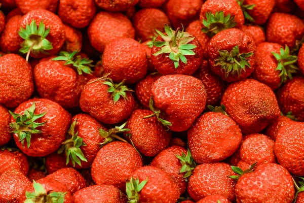
Card Title
The Card component is a versatile container for combining related information into a single, visually appealing unit.
1 2 3 4 5 6 7 8 9 | <div class="card shadow w-88"> <figure> <img src="https://cdn.frutjam.com/images/photo-1.jpg?format=webp&width=600&height=400" alt="Card Image" loading="lazy" /> </figure> <div class="card-content"> <h2 class="card-title">Card Title</h2> <p>The Card component is a versatile container for combining related information into a single, visually appealing unit.</p> </div> </div> |
1 2 3 4 5 6 7 8 9 | <div className="card shadow w-88"> <figure> <img src="https://cdn.frutjam.com/images/photo-1.jpg?format=webp&width=600&height=400" alt="Card Image" loading="lazy" /> </figure> <div className="card-content"> <h2 className="card-title">Card Title</h2> <p>The Card component is a versatile container for combining related information into a single, visually appealing unit.</p> </div> </div> |
帶有行動的卡片
使用 card-actions 為按鈕和操作控制項新增頁尾區域。
Card Title
A card with an actions footer for user interactions like buttons and links.
1 2 3 4 5 6 7 8 9 10 | <div class="card card-md shadow w-88"> <div class="card-content"> <h2 class="card-title">Card Title</h2> <p>A card with an actions footer for user interactions like buttons and links.</p> <div class="card-actions"> <button class="btn btn-primary">Accept</button> <button class="btn">Dismiss</button> </div> </div> </div> |
可點擊卡片
添加 card-link 到卡片內的一個鏈接,整個卡片將成為其點擊目標。該卡仍然是 article 帶有標題和段落,因此螢幕閱讀器遇到的是真正的連結而不是包裝,並且有一個製表位而不是多個。
Kyoto, day to night
Local setup notes, language resources and community links.
1 2 3 4 5 6 | <article class="card card-outline card-md w-88" aria-labelledby="kyoto"> <div class="card-content"> <h2 class="card-title" id="kyoto"><a class="card-link" href="/guides/kyoto">Kyoto, day to night</a></h2> <p>Local setup notes, language resources and community links.</p> </div> </article> |
1 2 3 4 5 6 | <article className="card card-outline card-md w-88" aria-labelledby="kyoto"> <div className="card-content"> <h2 className="card-title" id="kyoto"><a className="card-link" href="/guides/kyoto">Kyoto, day to night</a></h2> <p>Local setup notes, language resources and community links.</p> </div> </article> |
鍵盤焦點是正確的部分。否則,瀏覽器將僅概述連結文本,即滑鼠可以單擊卡片內任意位置的幾個單詞,因此 card-link 將環移到卡片上並隱藏裡面的環。戒指用途 currentColor,這意味著它仍然可讀 card-primary 以及每個主題。
卡片中的文字保持可選擇狀態,並且其他按鈕繼續工作,因此卡片可以同時承載主要目的地和次要操作。
1 2 3 4 5 6 7 8 9 10 | <article class="card card-outline card-md w-88" aria-labelledby="product-1"> <div class="card-content"> <h2 class="card-title" id="product-1"><a class="card-link" href="/products/1">Product 1</a></h2> <p>Description of the product.</p> <div class="card-actions"> <button class="btn btn-sm btn-primary">Add to cart</button> <button class="btn btn-sm btn-outline">Save</button> </div> </div> </article> |
卡片尺寸
從五種尺寸變體中進行選擇,以適應不同的內容密度和用例。
Extra Small
Compact card for minimal content.
Small
Small card for condensed information.
Medium
Medium card for standard content.
Large
Large card for prominent content display.
Extra Large
Extra large card for expansive content layouts.
1 2 3 4 5 6 7 8 9 10 11 12 13 14 15 16 17 18 19 20 21 22 23 24 25 26 27 28 29 30 31 32 33 34 | <div class="card card-xs card-outline"> <div class="card-content"> <h2 class="card-title">Extra Small</h2> <p>Compact card for minimal content.</p> </div> </div> <div class="card card-sm card-outline"> <div class="card-content"> <h2 class="card-title">Small</h2> <p>Small card for condensed information.</p> </div> </div> <div class="card card-md card-outline"> <div class="card-content"> <h2 class="card-title">Medium</h2> <p>Medium card for standard content.</p> </div> </div> <div class="card card-lg card-outline"> <div class="card-content"> <h2 class="card-title">Large</h2> <p>Large card for prominent content display.</p> </div> </div> <div class="card card-xl card-outline"> <div class="card-content"> <h2 class="card-title">Extra Large</h2> <p>Extra large card for expansive content layouts.</p> </div> </div> |
卡片顏色
將顏色變體應用於卡片以實現視覺區分和語義含義。
Default
Base card color using default theme background.
Primary
Primary color card for featured content.
Secondary
Secondary color card for supporting content.
Accent
Accent color card for emphasis.
Info
Information card for helpful content.
Success
Success card for positive outcomes.
Warning
Warning card for caution messages.
Error
Error card for error notifications.
Neutral
Neutral card for balanced design.
1 2 3 4 5 6 7 8 9 10 11 12 13 14 15 16 17 18 19 20 21 22 23 24 25 26 27 28 29 30 31 32 33 34 35 36 37 38 39 40 41 42 43 44 45 46 47 48 49 50 51 52 53 54 55 56 57 58 59 60 61 62 | <div class="card card-md"> <div class="card-content"> <h2 class="card-title">Default</h2> <p>Base card color using default theme background.</p> </div> </div> <div class="card card-md card-primary"> <div class="card-content"> <h2 class="card-title">Primary</h2> <p>Primary color card for featured content.</p> </div> </div> <div class="card card-md card-secondary"> <div class="card-content"> <h2 class="card-title">Secondary</h2> <p>Secondary color card for supporting content.</p> </div> </div> <div class="card card-md card-accent"> <div class="card-content"> <h2 class="card-title">Accent</h2> <p>Accent color card for emphasis.</p> </div> </div> <div class="card card-md card-info"> <div class="card-content"> <h2 class="card-title">Info</h2> <p>Information card for helpful content.</p> </div> </div> <div class="card card-md card-success"> <div class="card-content"> <h2 class="card-title">Success</h2> <p>Success card for positive outcomes.</p> </div> </div> <div class="card card-md card-warning"> <div class="card-content"> <h2 class="card-title">Warning</h2> <p>Warning card for caution messages.</p> </div> </div> <div class="card card-md card-error"> <div class="card-content"> <h2 class="card-title">Error</h2> <p>Error card for error notifications.</p> </div> </div> <div class="card card-md card-neutral"> <div class="card-content"> <h2 class="card-title">Neutral</h2> <p>Neutral card for balanced design.</p> </div> </div> |
自訂背景和文字顏色
直接在卡上使用任何 Tailwind 背景和文字顏色實用程式進行全顏色控制。
Custom Colors
Apply any background and text color using Tailwind utilities.
1 2 3 4 5 6 | <div class="card bg-primary text-on-primary w-88"> <div class="card-content"> <h2 class="card-title">Custom Colors</h2> <p>Apply any background and text color using Tailwind utilities.</p> </div> </div> |
卡片樣式
對卡片套用不同的邊框和樣式變體,以實現視覺區分。
大綱卡
Outline Style
Cards with visible borders for subtle separation from background.
Primary Outline
Outline card with primary color border.
1 2 3 4 5 6 7 8 9 10 11 12 13 | <div class="card card-md card-outline"> <div class="card-content"> <h2 class="card-title">Outline Style</h2> <p>Cards with visible borders for subtle separation from background.</p> </div> </div> <div class="card card-md card-outline card-primary"> <div class="card-content"> <h2 class="card-title">Primary Outline</h2> <p>Outline card with primary color border.</p> </div> </div> |
虛線卡
Dashed Style
Cards with dashed borders for visual interest.
Secondary Dashed
Dashed card with secondary color border.
1 2 3 4 5 6 7 8 9 10 11 12 13 | <div class="card card-md card-dashed"> <div class="card-content"> <h2 class="card-title">Dashed Style</h2> <p>Cards with dashed borders for visual interest.</p> </div> </div> <div class="card card-md card-dashed card-secondary"> <div class="card-content"> <h2 class="card-title">Secondary Dashed</h2> <p>Dashed card with secondary color border.</p> </div> </div> |
帶有圖像的卡片
將卡片與圖形結合以獲得包含視覺元素的內容。
圖片位於頂部
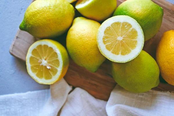
Blog Post Card
Display articles with featured images, titles, and summaries for content discovery.
1 2 3 4 5 6 7 8 9 | <div class="card card-md w-88 shadow-sm"> <figure> <img src="https://cdn.frutjam.com/images/photo-2.jpg?format=webp&width=600&height=400" alt="Blog Post" loading="lazy" /> </figure> <div class="card-content"> <h2 class="card-title">Blog Post Card</h2> <p>Display articles with featured images, titles, and summaries for content discovery.</p> </div> </div> |
圖片位於底部
Image Below Content
Place images after content for reverse visual hierarchy.
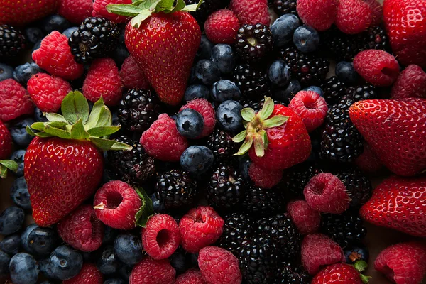
1 2 3 4 5 6 7 8 9 | <div class="card card-md w-88 shadow-sm"> <div class="card-content"> <h2 class="card-title">Image Below Content</h2> <p>Place images after content for reverse visual hierarchy.</p> </div> <figure> <img src="https://cdn.frutjam.com/images/photo-3.jpg?format=webp&width=600&height=400" alt="Footer Image" loading="lazy" /> </figure> </div> |
定價卡
展示帶有功能和號召性用語按鈕的定價層。
Startup Plan
- ✓ 25 websites
- ✓ 150 templates
- ✓ Advanced eCommerce
- ✗ Unlimited storage
1 2 3 4 5 6 7 8 9 10 11 12 13 14 15 16 17 18 19 20 21 22 23 24 25 26 27 28 29 30 31 | <div class="card card-lg card-outline"> <div class="card-content gap-4"> <div> <h2 class="card-title">Startup Plan</h2> <div class="flex items-baseline gap-2"> <span class="text-3xl font-bold">$49</span> <span class="text-sm text-on-base/60">/month</span> </div> </div> <div class="divider my-0"></div> <ul class="flex flex-col gap-3"> <li class="flex items-center gap-2"> <span class="badge badge-success badge-sm">✓</span> <span>25 websites</span> </li> <li class="flex items-center gap-2"> <span class="badge badge-success badge-sm">✓</span> <span>150 templates</span> </li> <li class="flex items-center gap-2"> <span class="badge badge-success badge-sm">✓</span> <span>Advanced eCommerce</span> </li> <li class="flex items-center gap-2"> <span class="badge badge-error badge-sm opacity-50">✗</span> <span class="opacity-50">Unlimited storage</span> </li> </ul> <button class="btn btn-primary w-full">Get Started</button> </div> </div> |
響應式卡片佈局
創建適應不同螢幕尺寸的靈活卡片佈局。

Responsive Layout
On desktop, image and content display side by side. On mobile, they stack vertically for optimal viewing experience.
1 2 3 4 5 6 7 8 9 10 11 12 13 14 15 16 17 18 | <div class="card card-lg w-160 shadow-sm"> <div class="grid grid-cols-12 gap-0"> <div class="col-span-12 lg:col-span-5"> <figure class="h-64"> <picture> <source media="(max-width: 1024px)" srcset="https://cdn.frutjam.com/images/photo-4.jpg?format=webp&width=640&height=427"> <img src="https://cdn.frutjam.com/images/photo-4.jpg?format=webp&width=600&height=400" alt="Layout Image" class="w-full h-full object-cover" loading="lazy" /> </picture> </figure> </div> <div class="col-span-12 lg:col-span-7"> <div class="card-content"> <h2 class="card-title">Responsive Layout</h2> <p>On desktop, image and content display side by side. On mobile, they stack vertically for optimal viewing experience.</p> </div> </div> </div> </div> |
組合變體
混合並搭配客製化卡片設計的尺寸、顏色和樣式變體。
Large Primary Outline
Combination of large size, primary color, and outline style.
Small Secondary Dashed
Compact card with dashed border in secondary color.
Extra Large Accent
Prominent card with accent color for feature display.
1 2 3 4 5 6 7 8 9 10 11 12 13 14 15 16 17 18 19 20 | <div class="card card-lg card-primary card-outline"> <div class="card-content"> <h2 class="card-title">Large Primary Outline</h2> <p>Combination of large size, primary color, and outline style.</p> </div> </div> <div class="card card-sm card-dashed card-secondary"> <div class="card-content"> <h2 class="card-title">Small Secondary Dashed</h2> <p>Compact card with dashed border in secondary color.</p> </div> </div> <div class="card card-xl card-accent"> <div class="card-content"> <h2 class="card-title">Extra Large Accent</h2> <p>Prominent card with accent color for feature display.</p> </div> </div> |
使用 Claude Code、Cursor 或其他 AI 編輯器?
Cherry MCP 為您的 AI 編輯器按需提供準確的 卡片 類別名稱和結構。不再有幻覺課程。